Dark trim is one of the most striking choices you can make on a house exterior, and also one of the least forgiving. A deep charcoal, forest green, or near-black trim line draws the eye straight to the windows, doors, and roofline. That means any colour mismatch, sheen problem, or sloppy cut line becomes far more visible than it would with white trim.
The good news is that dark trim pairs well with a wide range of body colours, provided you understand how light, undertone, and contrast interact on a large surface. This guide covers the colour families that work, the ones that fight each other, and the practical details that determine whether the finished job looks intentional or accidental.
Why Dark Trim Behaves Differently From White
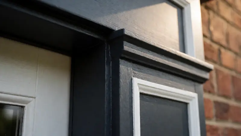
White trim is the default for a reason. It is forgiving, it hides minor imperfections, and it reflects light in a way that softens the whole facade. Dark trim does the opposite. It absorbs light, which makes the edges of your house read as graphic lines rather than soft transitions.
That graphic quality is what makes dark trim so appealing — and what makes the body colour choice so important. With white trim, the body colour does most of the talking. With dark trim, the contrast between body and trim becomes the dominant visual statement.
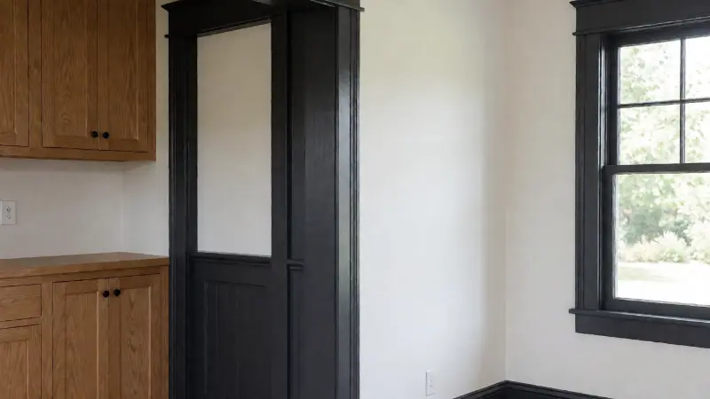
The role of undertone
Every paint colour has an undertone, whether it is warm, cool, or neutral. On a small sample chip, undertones are subtle. Across a whole wall in daylight, they become obvious. A greige that looked neutral in the store can read distinctly green or pink on a large exterior wall.
Dark trim colours usually fall into warm darks (brown-black, bronze, deep olive), cool darks (charcoal, blue-black, slate), or true neutrals. Matching the undertone of your trim to the undertone of your siding keeps the scheme coherent. Mixing a cool charcoal trim with a warm beige body often looks slightly off without anyone being able to say why.
Contrast level matters more than hue
There are three broad approaches. High contrast pairs a light or mid-tone body with dark trim for a crisp, traditional look. Low contrast uses a body colour close in value to the trim for a moody, modern result. Inverted contrast makes the siding dark and the trim lighter, which is a different design decision entirely.
Most homeowners asking about dark trim are considering high or moderate contrast. Low contrast schemes look sophisticated but need consistent lighting and disciplined detailing, because there is no strong line to disguise uneven surfaces.
Body Colours That Work With Dark Trim
The table below groups body colour families by how they interact with dark trim, along with the practical considerations for each. It is a design aid rather than a rulebook — the condition of your siding, the roof colour, and the surrounding landscape all influence the final result.
| Body Colour Family | Effect With Dark Trim | Best Suited To | Watch Out For |
|---|---|---|---|
| Warm white and cream | Classic high contrast; trim reads as sharp outline | Traditional, colonial, and farmhouse styles | Cream can look yellow in strong sun; check on site |
| Light greige and putty | Softer contrast; contemporary and calm | Modern suburban and craftsman homes | Green or pink undertones can surface outdoors |
| Mid-tone sage and grey-green | Harmonious with olive or charcoal trim | Cottage, bungalow, and heritage homes | Can look flat in shade; needs good light |
| Slate blue and grey-blue | Cool and crisp with near-black trim | Coastal and colonial revival styles | Strong sun can wash the blue out |
| Warm taupe and clay | Rich pairing with bronze or brown-black trim | Mediterranean and ranch styles | Can look heavy if the roof is also dark |
| Deep body with matching dark trim | Low contrast, moody, and architectural | Contemporary and minimalist homes | Requires excellent prep; flaws show |
| White body with dark trim | Maximum contrast and formality | Brick and stone facades with white siding | Can feel stark if the trim is pure black |
Warm whites and creams
A warm white body with charcoal or bronze trim is the most reliable combination in this family. It gives you the crisp definition of a traditional scheme while the dark trim adds weight and modernity. The trick is to avoid a body colour that is too yellow, because it can turn brassy in direct afternoon sun.
If you have brick or stone on the facade, pull the body colour towards the lightest tone in the masonry rather than picking white blind. The trim should relate to the darkest tone in the brick or the roof.
Greige and soft neutral tones
Greige sits between grey and beige and works well with dark trim because it provides contrast without shouting. It suits homes where the architecture is relatively simple and the trim lines are clean. Choose a greige with a slightly warm or neutral undertone rather than one leaning strongly green or violet.
On a large wall, greige tends to lighten in full sun and deepen in shade. Test it on more than one elevation, because a north-facing wall will look noticeably different from a south-facing one.
Sage, olive, and grey-green
Green tones pair naturally with dark trim, particularly olive, bronze, and near-black. A mid-tone sage body with deep bronze trim is a classic heritage combination that suits older homes well. The risk is flatness — if the light is poor, green can look muddy rather than restful.
Choosing a green with a bit of grey in it rather than a pure, saturated green keeps the scheme grounded. Very saturated greens can dominate the street, which is rarely the intent.
Slate blue and coastal greys
Blue-grey bodies with near-black or charcoal trim give a crisp, slightly nautical feel. This combination works especially well with white or light stone accents and a grey roof. In strong sunlight, however, blues tend to desaturate, so a colour that looks rich on the chip may appear washed out on the wall.
If you are set on blue, look for one with enough depth that it still reads as blue at midday. A slightly greyer blue holds up better than a clear, bright one.
Dark Trim Colours Worth Considering
Not all dark trim is black. There is a useful range between charcoal and true black, and the choice affects how the scheme feels.
- Charcoal: The safest dark. Reads as near-black in shadow and soft grey in full sun.
- Bronze and brown-black: Warmer and more traditional. Pairs beautifully with cream, taupe, and brick.
- Blue-black: Cooler and more modern. Works with grey and blue bodies.
- Deep forest and olive: Rich and heritage-oriented. Suits green and stone facades.
- Espresso and dark umber: Warm and heavy. Best with lighter bodies to avoid a gloomy result.
- Slate and iron grey: Mid-dark rather than truly dark. Softer contrast, less graphic.
True black can work, but it is unyielding. On a facade with any irregularities, true black trim highlights every variation. A very dark charcoal or brown-black is usually more flattering while still reading as dark from the street.
Colour Combinations to Avoid
Some pairings create tension rather than contrast. These are not absolute rules, but they are the combinations that most often disappoint homeowners after the scaffolding comes down.
Dark trim with a mid-tone warm beige
A heavily yellow-beige body with a cool charcoal trim often looks conflicted, because the warm and cool undertones pull against each other. If you want beige, choose a warmer trim such as bronze or brown-black, or shift the body towards greige.
Dark trim with a dark roof and dark siding
When the roof, siding, and trim are all dark, the house can lose its definition and appear as a single mass. If you want a dark body, consider keeping the trim slightly lighter or using a lighter roof to preserve some separation. Alternatively, use a lighter accent colour on the front door and garage to break up the elevation.
Pure black trim on a heavily textured wall
Stucco, rough brick, and heavy siding profiles create shadows of their own. Pairing them with pure black trim amplifies every texture and shadow, which can look busy. A softer charcoal or bronze works better on textured surfaces.
Strong accent colours in too many places
Dark trim is already a statement. Adding a brightly coloured front door, contrasting garage doors, and coloured shutters on top of that usually creates visual noise. Pick one accent and let everything else support it.
Sheen, Finish, and Surface Preparation
Colour is only part of the result. The sheen level and the quality of the preparation determine how the finished paint performs and how the colour reads in changing light.
Choosing the right sheen
Exterior trim is usually painted in a satin or semi-gloss finish. Higher sheen is more durable and easier to clean, but it also highlights surface imperfections. Lower sheen looks softer but collects dirt more readily and is harder to wipe down. For dark trim, a satin finish tends to strike a good balance.
Dark colours absorb heat, and heat accelerates paint degradation. A good-quality exterior coating formulated for the climate you live in will hold up better than a general-purpose product. If you are painting in a very sunny region, dark trim may need more frequent attention than a lighter colour would.
Prep is where the job is won
Dark paint shows every defect. Sanding marks, caulk smears, and uneven edges are far more visible under dark trim than under white. Take the extra time to fill, sand, and prime properly, and use a caulk that accepts paint cleanly.
Priming matters more with dark colours because of the pigment load. Some deep colours require a tinted primer to reach full opacity in two coats rather than three or four. Ask your paint supplier for a tinted primer matched to the topcoat.
Bonding to difficult substrates
Exterior walls are not always simple. If your facade includes a waterproofing membrane, a coated panel, or a cement board product, adhesion and compatibility matter before you even think about colour. Knowing what can safely be painted over is a genuine technical question — for instance, there are specific considerations when deciding whether you can paint over RedGard waterproofing membrane, and similar caveats apply when asking can you paint GoBoard panels. Get this wrong and the topcoat will fail regardless of how good the colour looks.
Working Around Exterior Fittings and Penetrations
Most houses have things protruding through the exterior wall that need to be accommodated in the paint scheme. Vent pipes, flues, meter boxes, and downpipes all interrupt the clean line that dark trim is meant to create.
Where a pipe runs up an exterior wall, the tidy solution is usually to paint it in the trim colour so it visually disappears into the dark element rather than standing out as a white cylinder against siding. If you are dealing with a vent termination and want to understand the rules that govern it, this guide to a plumbing vent through an exterior wall explains the code considerations before you start painting around it.
Colour-matching the details
Downpipes, gutters, and fascia are often supplied in a limited range of factory colours. If your chosen trim colour does not match them, you have two options: paint them to match, or deliberately choose a complementary tone. Half-matched trim and rainwater goods tend to look unresolved.
Window frames, garage doors, and front doors should be treated as part of the same scheme. A common approach is to keep the trim dark, the body lighter, and the front door in a distinctly different accent colour. Garage doors often look best when they match the body colour rather than the trim, so they recede.
How to Test Colours Before You Commit
Paint chips are a starting point, not an answer. Colour behaves differently on a large vertical surface, under different times of day, and against your specific roof and hardscaping.
- Paint large sample boards rather than relying on small chips.
- Place samples on at least two elevations, including the shadiest one.
- View them at morning, midday, and late afternoon.
- Look at them from the street, not just up close.
- Check how the body colour relates to the roof and any fixed stone or brick.
- Compare your trim sample against the actual trim, not against paper.
- Live with the samples for several days before deciding.
If you are working with a designer or a paint store, ask about larger sample pots. The small cost of a few test boards is trivial compared with repainting a whole house because the undertone was wrong.
Consider the neighbours and the streetscape
Exterior colour affects more than your own house. A very dark trim scheme can stand out strongly in a street of pale homes, which some people love and some regret. If you are in a historic district or a community with architectural guidelines, check the rules before you buy paint. Some associations restrict colour palettes.
Maintenance and Long-Term Considerations
Dark trim is not inherently high maintenance, but it does show certain things more readily. Chalky residue, dust, and pollen are more visible against dark surfaces. On the other hand, some airborne grime that stains white trim is less noticeable on dark colours.
Fading is a real consideration. Dark pigments, particularly some reds and blues, can fade over years of UV exposure. A high-quality exterior coating with good lightfastness will hold its colour longer. Expect to touch up dark trim periodically, and keep a labelled can of the exact colour for that purpose.
Caulk lines deserve attention too. Dark trim makes a poorly applied caulk bead obvious, and some caulks yellow or crack over time. Use a paintable exterior caulk and apply it neatly, then paint over it so the joint disappears.
Resale perception
Bold exterior colour choices are personal. A well-executed dark trim scheme can boost kerb appeal and make a house feel considered and current. A poorly executed one can make a property harder to sell, because buyers struggle to see past an unusual palette. If you plan to sell in the near future, a classic combination of light body and dark charcoal or bronze trim is a safer bet than an experimental one.
FAQ
What body colour goes best with black trim?
Warm white, cream, light greige, and soft grey-green bodies all work well with near-black trim. The key is to match undertones and choose a contrast level you are happy to live with.
Is dark trim out of style?
Dark trim has been a popular design choice for many years and continues to appear on both traditional and contemporary homes. Trends shift, but a well-chosen dark trim scheme tends to age better than a purely fashionable colour.
Does dark exterior paint fade faster?
Dark pigments can fade under prolonged UV exposure, and dark surfaces absorb more heat. A quality exterior coating and periodic touch-ups help maintain the colour over time.
Should the front door match the trim?
It can, but a contrasting accent colour often works better because it draws attention to the entry. If the trim is already dark, a warmer or brighter door colour can create a useful focal point.
What sheen should I use on dark exterior trim?
Satin is a common choice because it balances durability with a finish that does not exaggerate surface flaws. Semi-gloss is harder wearing but shows imperfections more clearly.
How many coats does dark exterior paint need?
Often two topcoats over a tinted primer, but very deep colours may need more to reach even coverage. Follow the manufacturer’s guidance and check the finish in daylight before deciding it is done.
Bottom Line
The best exterior paint colours for dark trim are the ones that establish a clear, deliberate relationship between the body, the trim, and the fixed elements you cannot change, such as the roof and any brick or stone. Warm whites and creams give classic high contrast. Greige and soft neutrals deliver calm, contemporary contrast. Sage, slate blue, and taupe each bring their own character, provided the undertones align.
Whatever you choose, invest in test boards, prepare the surface properly, and match the sheen and primer to the colour. Dark trim rewards care and punishes shortcuts more than any other exterior scheme. Get those details right, and the result is a facade that looks considered from the street and holds up for years.