The quest for the ideal warm off-white paint color is a journey many homeowners and designers embark upon. Benjamin Moore Swiss Coffee stands as a beloved classic, celebrated for its creamy, inviting warmth that can transform any space. However, when brand loyalty, existing paint schemes, or contractor preferences lean towards Sherwin Williams, finding a truly comparable shade becomes a critical mission.
This challenge is more complex than simply picking a similar-looking chip. Paint colors, especially nuanced off-whites, carry subtle undertones that react uniquely to lighting and surrounding elements. Understanding these complexities is key to achieving that coveted Swiss Coffee aesthetic with a Sherwin Williams alternative.
This comprehensive guide delves into the heart of Benjamin Moore Swiss Coffee, explores the intricacies of cross-brand paint matching, and unveils the top Sherwin Williams equivalents. We will equip you with the knowledge and strategies to confidently select a paint color that captures the essence of Swiss Coffee, ensuring your home exudes the same inviting warmth and sophistication.
Understanding Benjamin Moore Swiss Coffee: The Gold Standard of Warm Off-Whites
Benjamin Moore Swiss Coffee (OC-45) is renowned for its exceptional balance of warmth and neutrality. It’s not a stark white, nor is it overtly yellow or beige; instead, it strikes a delicate balance that makes it incredibly versatile.
Its charm lies in its subtle undertones, which can appear creamy, slightly yellow, or even a touch greige depending on the light. This chameleon-like quality allows it to harmonize beautifully with a wide range of decor styles, from traditional to modern farmhouse.
Designers frequently recommend Swiss Coffee for its ability to create a soft, welcoming atmosphere without feeling too heavy or dated. It brightens rooms while maintaining a cozy, lived-in feel, making it a perennial favorite for living areas, bedrooms, and kitchens alike.
The Light Reflectance Value (LRV) of Benjamin Moore Swiss Coffee is approximately 83.93. This high LRV indicates that it reflects a significant amount of light, contributing to a brighter and more spacious feel in a room.
The Challenge of Cross-Brand Paint Matching
Finding an exact “dupe” for a paint color across different brands is a common misconception. Paint manufacturers use proprietary formulas, unique pigment blends, and different bases. This means that even if two colors look identical on a small swatch, their behavior on a large wall, under varying light conditions, can be distinctly different.
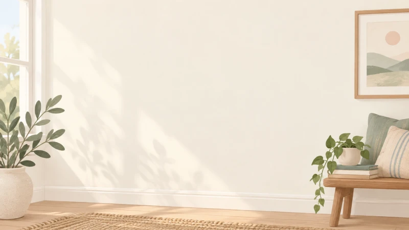
The primary hurdle in cross-brand matching lies in the subtle undertones. A color that appears a perfect match in one lighting scenario might reveal unexpected yellow, green, or pink undertones in another. Natural light from north-facing rooms tends to be cooler and can pull out gray or green undertones, while south-facing rooms with warmer light might emphasize yellow or cream.
Furthermore, the sheen of the paint plays a significant role in how a color is perceived. A flat finish absorbs more light and can make a color appear softer, while a satin or semi-gloss finish reflects more light, often making the color appear slightly brighter and more saturated. These differences compound the difficulty when trying to replicate a precise look from one brand to another.
The Myth of the “Exact Duplicate”
It is crucial to set realistic expectations when searching for a Benjamin Moore Swiss Coffee Sherwin Williams equivalent. Instead of chasing an “exact duplicate,” focus on finding a “very close match” or a color that evokes a “similar vibe.” The goal is to capture the essence and functionality of Swiss Coffee—its warmth, softness, and versatility—rather than a pixel-perfect copy.
Embrace the slight variations as opportunities to tailor the color even more precisely to your specific home and lighting conditions. A slightly different undertone might, in fact, work better with your existing furnishings or natural light.
Top Sherwin Williams Equivalents for Benjamin Moore Swiss Coffee
While no Sherwin Williams color is an identical twin to Benjamin Moore Swiss Coffee, several options come remarkably close, offering a similar warm, inviting off-white aesthetic. Each of these contenders has its own subtle nuances, making them suitable for different preferences and lighting situations.
When evaluating these options, consider their LRV and primary undertones. These factors are crucial in predicting how the color will behave in your space.
Sherwin Williams Alabaster (SW 7008)
Alabaster is arguably the most frequently recommended Sherwin Williams alternative to Swiss Coffee. It is a soft, warm white that avoids harshness, making it incredibly popular.
With an LRV of 82, it is very close to Swiss Coffee’s reflectance value. Alabaster has subtle creamy undertones, leaning slightly towards yellow, but it remains remarkably neutral, preventing it from looking overly yellow or stark.
It is an excellent choice for creating a serene and inviting atmosphere in living rooms, bedrooms, and even exteriors. Alabaster pairs beautifully with natural wood tones and a variety of accent colors.
Sherwin Williams Pure White (SW 7005)
For those who desire a cleaner, slightly brighter off-white while still retaining warmth, Pure White is an excellent option. Its LRV is 84, making it marginally brighter than Swiss Coffee.
Pure White has very minimal undertones, often described as a true white with just a whisper of warmth. It lacks the strong yellow or greige notes that can sometimes appear in other off-whites.
This color is ideal for trim, ceilings, and walls where you want a crisp yet soft look. It works well in contemporary spaces and helps create a fresh, airy feel, providing a clean backdrop for decor.
Sherwin Williams Creamy (SW 7012)
If your preference leans towards a noticeably warmer, more yellow-toned off-white, Sherwin Williams Creamy might be your perfect match. Its LRV is 81, making it slightly less reflective than Swiss Coffee.
As its name suggests, Creamy has distinct yellow undertones, giving it a rich, buttery feel. It’s a fantastic choice for rooms that lack natural light or where you want to emphasize a cozy, traditional aesthetic.
This color can bring a wonderful glow to a room and pairs well with antique furnishings, warm wood cabinetry, and earthy color palettes. It’s more overtly warm than Swiss Coffee but shares its inviting quality.
Sherwin Williams Aesthetic White (SW 7035)
Aesthetic White offers a slightly different take on the warm off-white, incorporating a touch more greige into its undertones. Its LRV is 73, indicating it’s a bit deeper and less reflective than Swiss Coffee.
This color is a sophisticated choice for those who find pure whites too stark and creamy whites too yellow. It provides warmth with a subtle grounding effect, making it feel very balanced.
Aesthetic White is particularly effective in spaces where you want a refined, understated elegance. It can work beautifully with both cool and warm decor elements, bridging the gap between them.
Sherwin Williams Dover White (SW 6385)
Dover White is another classic warm white from Sherwin Williams, often compared to the warmth of Benjamin Moore’s popular off-whites. Its LRV is 83, very close to Swiss Coffee.
It possesses soft, creamy yellow undertones that are noticeable but not overwhelming. Dover White is a tried-and-true choice for creating bright yet inviting spaces, particularly in homes with a traditional or transitional style.
This color is versatile enough for walls, trim, and cabinetry, providing a consistent warm glow throughout a home. It’s a reliable option for those seeking a comforting and timeless off-white.
Sherwin Williams Westhighland White (SW 7566)
Westhighland White is a lovely, soft off-white with pronounced creamy undertones, making it a strong contender for those who love the warmth of Swiss Coffee. Its LRV is 86, making it slightly brighter.
This color offers a beautiful balance between white and cream, avoiding any starkness. It creates a gentle, welcoming atmosphere, reminiscent of a cozy, sunlit room.
It’s an excellent choice for bedrooms, nurseries, and living areas where comfort and softness are paramount. Westhighland White provides a clean yet warm backdrop that complements a wide array of interior design choices.
The Critical Step: Testing Paint Samples Effectively
Regardless of how many recommendations you receive, testing paint samples in your own home is the single most critical step. Relying solely on small paint chips or online images is a recipe for disappointment. The way a color interacts with your specific lighting, existing furnishings, and even the natural environment outside your windows is unique.
Start by purchasing sample pots of your top two or three Sherwin Williams contenders. Do not paint directly onto your wall, as the existing wall color can influence the perception of the new sample. Instead, paint large swatches, at least 12×12 inches, onto white poster board or foam core.
Tape these painted boards to different walls in the room you intend to paint. Observe them throughout the day, in varying natural light conditions (morning, noon, evening), and under artificial light. Pay close attention to how the undertones shift and if any unexpected colors emerge. This thorough testing process is as essential as ensuring the reliability of Ariens AX engines before investing in new equipment; a small investment of time now prevents major headaches later.
Move the samples from wall to wall. Notice how the color appears on a wall facing a window versus an interior wall. This will reveal the true character of the paint in your unique environment. The right sample will often “sing” to you, feeling harmonious with its surroundings.
Understanding LRV (Light Reflectance Value) in Your Search
Light Reflectance Value (LRV) is a crucial metric that quantifies the percentage of visible and usable light that a paint color reflects from its surface. It ranges from 0 (absolute black, absorbing all light) to 100 (pure white, reflecting all light).
Understanding LRV helps you predict how bright or dark a paint color will appear in a room. Benjamin Moore Swiss Coffee has an LRV of approximately 83.93. When seeking a Sherwin Williams equivalent, looking for colors with an LRV in a similar range (typically 80-85) will ensure a comparable level of brightness.
However, LRV doesn’t tell the whole story about undertones. Two colors can have similar LRVs but vastly different undertones, leading to entirely different feelings in a room. For example, a color with an LRV of 82 and yellow undertones will feel very different from a color with an LRV of 82 and gray undertones.
Use LRV as a guide for brightness, but always rely on physical samples to assess the true color and its undertones in your specific space.
Beyond the Walls: Coordinating Colors and Finishes
Selecting the right paint color is just one piece of the puzzle. How that color interacts with your existing trim, flooring, furniture, and even the lighting fixtures significantly impacts the overall aesthetic. A true Sherwin Williams equivalent to Swiss Coffee should not only look good on its own but also complement your home’s fixed elements.
Consider the trim color in your home. If your trim is a crisp, cool white, a very warm, creamy off-white on the walls might create too much contrast. Conversely, if your trim is also warm, a harmonious blend can be achieved. Testing your chosen wall color alongside your trim color on a single board is highly recommended.
The sheen of your paint also plays a vital role. Flat finishes offer a soft, velvety look that can hide imperfections but are less durable. Eggshell and satin finishes are more common for walls, providing a subtle sheen and increased durability. Semi-gloss is typically reserved for trim and doors. The higher the sheen, the more light is reflected, which can make a color appear slightly brighter and reveal more of its undertones.
Artificial lighting is another critical factor. Warm light bulbs (2700K-3000K) will enhance the yellow and red undertones in a paint color, making it appear cozier. Cooler light bulbs (4000K-5000K) will emphasize blue and gray undertones, making a color appear crisper. Experiment with different bulb temperatures to see how they influence your chosen Sherwin Williams equivalent, much like optimizing the performance of a heating system, whether it’s an Airtemp vs. Goodman unit, to achieve perfect indoor comfort.
Practical Scenarios and Expert Tips
Navigating the world of paint can be daunting, but with a strategic approach, you can achieve professional-level results. Here are some practical scenarios and expert tips to guide your process.
Scenario 1: Repainting an Entire House
When painting multiple rooms, consider a cohesive color palette. Choosing one primary off-white, like a Sherwin Williams equivalent to Swiss Coffee, for most common areas creates flow. Then, introduce subtle variations or complementary colors in individual rooms for personality. Ensure consistency in sheen, especially in open-concept layouts, to maintain a harmonious feel.
Scenario 2: Matching Existing Swiss Coffee Trim
If your trim is already painted in Benjamin Moore Swiss Coffee and you want Sherwin Williams walls, the goal is to find a wall color that complements, rather than clashes with, the trim. Often, a slightly deeper or more saturated version of the warm off-white, or even a very light greige, can work beautifully. Sample extensively to ensure the trim and wall colors don’t fight for attention.
Scenario 3: Creating a Cohesive Open-Concept Space
In open-concept homes, the chosen Sherwin Williams equivalent needs to flow seamlessly from one functional area to another. This is where comprehensive sampling on multiple walls and observing the color at different times of day becomes paramount. A color that looks perfect in the kitchen might appear different in the living room due to varying light sources and exposure.
Tips for Working with Paint Professionals
Always communicate your expectations clearly with your painter. Provide them with the exact paint color name, number, and desired sheen. If you’ve done extensive sampling, show them the approved swatches. Discuss surface preparation; a well-prepared surface is crucial for a flawless finish, much like understanding the root cause of a Carrier furnace limit circuit lockout is essential for a proper repair.
Understanding Paint Bases and Custom Tints
Paint companies use different bases (e.g., white base, pastel base, deep base) into which pigments (tints) are added. This is why a direct “color match” from one brand to another isn’t always perfect; the base formula itself is different. While paint stores can often “color match” a competitor’s shade using their own tinting systems, the result may not be an exact replica due to these fundamental differences in base and pigment composition. Always opt for the manufacturer’s original formula for the most accurate representation of a color.
Troubleshooting Common Paint Matching Mistakes
Even with the best intentions, mistakes can happen when trying to find the perfect paint match. Being aware of these common pitfalls can help you avoid them.
One frequent error is **ignoring undertones**. A color might appear white at first glance, but if it has strong blue undertones, it will clash with warm wood tones. Always consciously look for the subtle hints of color beneath the main hue.
Another mistake is **not sampling adequately**. Judging a color from a small chip or a single swatch on one wall is insufficient. The color will look different on a larger surface and under various lighting conditions. Always use large poster board samples and move them around the room.
**Forgetting about existing fixed elements** can lead to disappointment. Your flooring, cabinetry, countertops, and even your roof color (for exteriors) all have their own undertones. The new paint color must harmonize with these elements, not fight against them. Take photos of your space and bring them to the paint store for guidance.
Finally, **rushing the decision** often leads to regret. Paint is a significant investment of time and money. Take your time with sampling, live with the swatches for a few days, and observe them during different parts of the day. A thoughtful decision now will save you from repainting later, just as careful diagnosis is key to resolving a Carrier furnace limit circuit lockout efficiently and effectively.
The Definitive Sherwin Williams Equivalent Table
To help simplify your decision, here is a comparative table summarizing the key characteristics of Benjamin Moore Swiss Coffee and its top Sherwin Williams equivalents. This table serves as a quick reference for their LRV, primary undertones, and general feel, aiding you in narrowing down your choices.
| BM Color | SW Equivalent | LRV (BM) | LRV (SW) | Key Undertones | Notes/Best Use |
|---|---|---|---|---|---|
| Benjamin Moore Swiss Coffee (OC-45) | N/A (Original) | 83.93 | N/A | Creamy, slight yellow/greige | Versatile, warm, inviting, classic off-white. |
| Sherwin Williams Alabaster (SW 7008) | N/A | 82 | Soft creamy, subtle yellow | Most popular equivalent, very warm but neutral. | |
| Sherwin Williams Pure White (SW 7005) | N/A | 84 | Very minimal warmth, clean | Brighter, crisp yet soft, great for trim and ceilings. | |
| Sherwin Williams Creamy (SW 7012) | N/A | 81 | Stronger yellow, buttery | For a richer, more pronounced warm/yellow feel. | |
| Sherwin Williams Aesthetic White (SW 7035) | N/A | 73 | Creamy with a touch of greige | Sophisticated, grounded warm off-white. | |
| Sherwin Williams Dover White (SW 6385) | N/A | 83 | Soft creamy yellow | Classic warm white, timeless and comforting. | |
| Sherwin Williams Westhighland White (SW 7566) | N/A | 86 | Noticeably creamy, soft yellow | Bright and inviting, without being stark. |
Conclusion
The journey to finding the perfect Benjamin Moore Swiss Coffee Sherwin Williams equivalent is one of careful consideration and informed decision-making. While no two paint colors from different brands will ever be identical, understanding the nuances of undertones, LRV, and lighting allows you to achieve a beautifully similar aesthetic.
By focusing on Sherwin Williams Alabaster, Pure White, Creamy, Aesthetic White, Dover White, or Westhighland White, you have a strong starting point. Remember that thorough sampling in your home’s unique environment is paramount. Observe how each color interacts with natural and artificial light, and how it harmonizes with your existing furnishings and fixed elements.
Armed with this comprehensive knowledge and a strategic approach to testing, you are now well-equipped to select a Sherwin Williams paint color that captures the timeless warmth and inviting elegance of Benjamin Moore Swiss Coffee. Your home will thank you for the thoughtful consideration, resulting in a space that feels perfectly tailored and beautifully cohesive.